How To Use Colour In A Small Room
A practical step-by-step guide to how to use colour in a small room, including preparation, instructions, common issues, tips, and next steps.
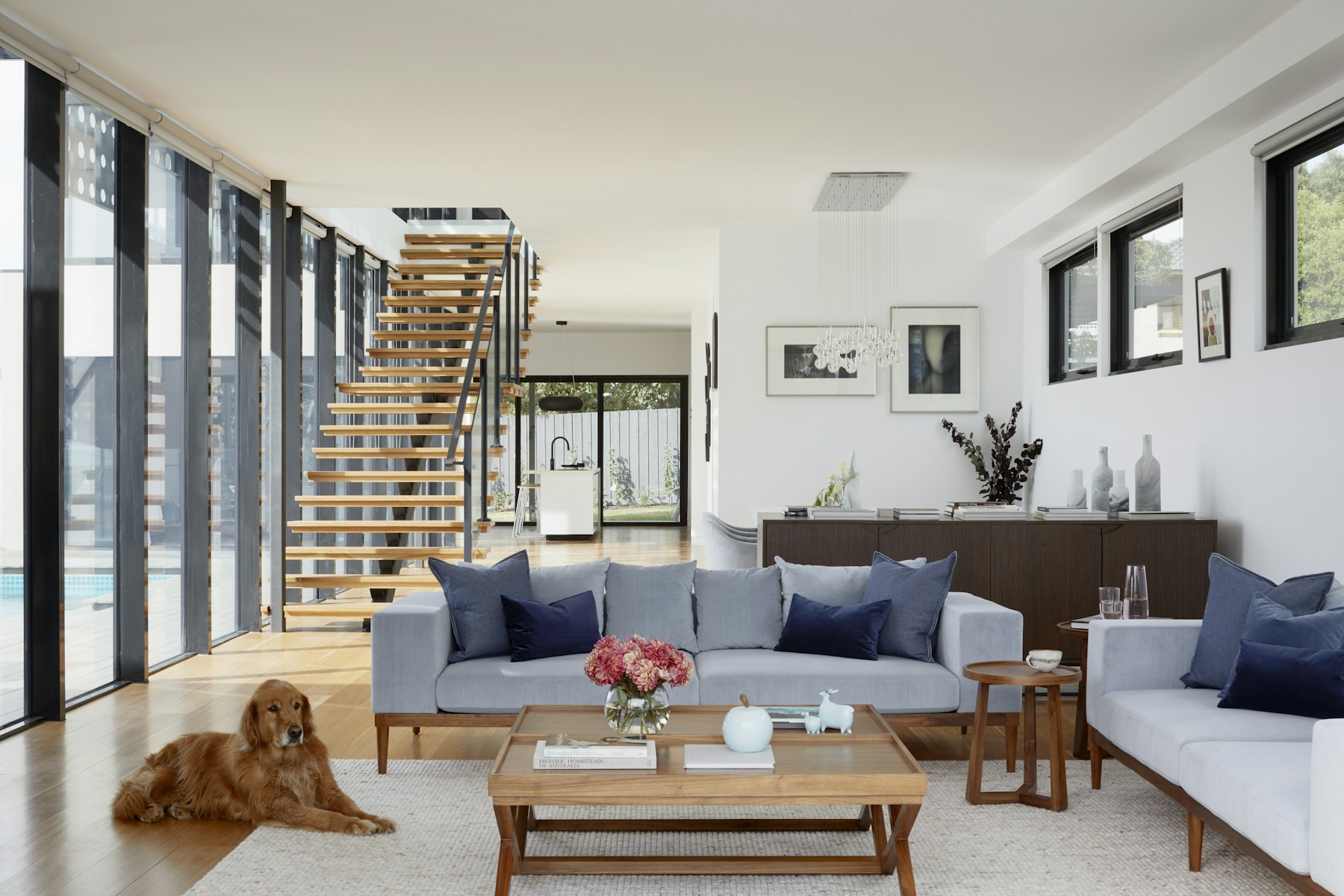
How To Use Colour In A Small Room
Using colour effectively in a small room can transform it from feeling cramped to spacious, bright, and inviting. This guide explains how to choose and apply colours that maximise natural light and create an illusion of greater space. It's especially useful for homeowners or renters looking to refresh a compact bedroom, bathroom, home office, or living area without undertaking major structural changes.
Fast Answer
- Core Principle: Light, cool, or neutral shades
- Key Action: Focus on a monochromatic or analogous scheme
- Avoid: Dark, heavy patterns on all walls
- Pro Tip: Test colours extensively in natural light
Before You Start
- Colour cards and paint samples: Essential for visualising options.
- Measuring tape: To gauge wall sizes and plan colour breaks.
- Good lighting: Ensure both natural and artificial light sources are working.
- Mood board materials: Collect images, fabric swatches, and small items to inspire your palette.
- Cleaning supplies: Sugar soap or mild detergent for wall preparation.
- Painter's tape: For clean lines and protecting trim.
- Paint brushes and rollers: Appropriate sizes for walls and detail work.
- Primer: Especially important for consistent colour application and coverage.
- Drop cloths or old sheets: To protect floors and furniture.
- Ventilation fan or open windows: For safety during painting.
- Understanding of room's purpose: Consider how the room is used to influence colour choice.
- Existing furniture layout: Factor in how furniture will interact with the chosen colours.
Step-by-Step Instructions
1. Assess Your Room's Natural and Artificial Light
Before you even think about picking up a colour card, take time to understand the light in your small room. Natural light varies significantly depending on which direction your windows face. North-facing rooms tend to receive cooler, softer light, while south-facing rooms get brighter, warmer light throughout the day.
Observe how the light changes from morning to evening. Also, consider your artificial lighting. Are your bulbs warm or cool in tone? These factors will have a major impact on how any colour appears on your walls. A colour that looks vibrant in a brightly lit showroom might appear dull in a dimly lit corner of your home.
2. Choose Your Primary Colour Palette Carefully
For small rooms, the general rule is to lean towards lighter colours. Light colours reflect more light, making a room feel more open and airy. Think about soft neutrals like off-whites, pale greys, or very light beige tones. These provide a clean, expansive backdrop that can make walls seem to recede.
Cool colours, such as pale blues, greens, and lavenders, also work exceptionally well. These colours tend to evoke a sense of calm and distance, tricking the eye into perceiving more space. Avoid very dark or overly saturated colours on all walls, as these can absorb light and make the room feel smaller and more enclosed.
3. Employ Monochromatic or Analogous Colour Schemes
To create a cohesive and harmonious feel that expands a small space, consider a monochromatic or analogous colour scheme. A monochromatic scheme uses different shades, tints, and tones of a single colour. For example, a pale blue wall with a slightly darker blue cushion and an even lighter blue vase.
An analogous scheme uses colours that are next to each other on the colour wheel, such as blue, blue-green, and green. Both approaches create a seamless flow, guiding the eye smoothly around the room without abrupt visual breaks, which can make a small space feel larger and more organised. This continuous look is key to how to use colour in a small room effectively.
4. Strategically Introduce Accent Colours
While light and cool colours dominate, a small room doesn't have to be bland. Accent colours, used sparingly and thoughtfully, can add personality and depth. Instead of painting an entire wall a bold colour, consider using accents in smaller doses. This could be through cushions, throws, artwork, lampshades, or a single piece of furniture.
A feature wall can work in a small room, but choose a wall that doesn't overwhelm the space. Often, the wall furthest from the entrance, or one with architectural interest like a fireplace, is a good candidate. Ensure the accent colour complements your main palette and doesn't compete for attention.
5. Consider Ceiling and Floor Colours
The colours of your ceiling and floor play a critical role in how a small room is perceived. Painting the ceiling a lighter colour than the walls – typically white or a very pale version of the wall colour – can make the room feel taller and more expansive, drawing the eye upwards. A dark ceiling, by contrast, can make a room feel cosier but also lower and more enclosed.
For flooring, lighter colours or materials that reflect light (like polished wood or light tiles) can also contribute to an open feel. If you have darker flooring, try to keep the walls light to balance the space. Creating a continuous flow of colour from floor to wall (e.g., light carpet fading into light walls) can also visually extend the room.
6. Utilise Stripes and Subtle Patterns Sparingly
While busy patterns can overwhelm a small space, strategic use of stripes or subtle patterns can be beneficial. Vertical stripes, for example, can visually 'lift' the ceiling, making the room feel taller. You can achieve this with wallpaper or by carefully painting stripes.
If using patterns, opt for small-scale, delicate designs rather than large, bold ones. Consider patterns on one wall, or on textiles like curtains or cushions, rather than on all walls. The key is to add visual interest without creating clutter or breaking up the sense of continuous space.
7. Test Colours Extensively Before Committing
This step cannot be overstated. Never rely solely on small paint chips. Purchase sample pots of your top 2-3 colour choices. Paint large swatches – at least A3 size or larger – on different walls in the room.
Observe these samples throughout the day and evening, under both natural and artificial light. See how they interact with your existing furniture, flooring, and any artwork you plan to keep. Colours can look vastly different from the sample card once applied to a larger surface. This testing phase is crucial for ensuring you truly love the colour in its intended environment and is central to how to use colour in a small room successfully.
8. Prepare the Room and Apply Your Chosen Colours
Once you've finalised your colour choices, it's time for preparation. Clear the room of furniture as much as possible, or move it to the centre and cover it. Lay down drop cloths. Clean your walls thoroughly with sugar soap to remove dirt and grease, then rinse and allow to dry completely. Mask off all trim, skirting boards, windows, and door frames with painter's tape.
Apply a good quality primer, especially if you're making a significant colour change or painting over darker colours. This ensures even coverage and true colour representation. Finally, apply your paint using rollers for large surfaces and brushes for edges and details. Apply at least two coats, allowing adequate drying time between each.
Quick Reference
| Situation | Use this | Why |
|---|---|---|
| Room feels too dark | Light, high LRV colours | Reflects more light, brightens the space. |
| Room feels cramped | Cool tones (blues, greens, purples) | Cool colours recede, creating an illusion of depth. |
| Need visual interest without clutter | Monochromatic scheme with varied textures | Adds depth and sophistication without overwhelming the eye. |
| Ceiling feels low | Lighter ceiling colour than walls | Draws the eye upwards, making the room feel taller. |
| Want a feature wall | Smallest wall, or wall with architectural detail | Provides a focal point without closing in the room. |
| Room lacks warmth | Warm accent colours in soft furnishings | Injects warmth without committing to a full wall of a warm colour. |
Common Problems When You How To Use Colour In A Small Room
Problem: The room still feels small and cramped.
Fix: This often happens when colours, even light ones, have strong warm undertones, or when too many different colours are used. Review your primary wall colour. Is it truly a cool neutral, or does it lean yellow or peach? Warm colours tend to advance, making walls feel closer. Simplify your palette: try a strictly monochromatic or analogous scheme. Also, ensure your ceiling is a lighter shade than your walls, ideally white or a very pale version of the wall colour, to create a sense of height. Remove any large, dark, or busy patterns on textiles or furniture that might be breaking up the visual flow.
Problem: The chosen colour looks completely different on the wall than on the sample.
Fix: This is a very common issue due to lighting. The small sample card doesn't show the true effect of a large area of colour. Your room's natural light (north, south, east, west facing), artificial lighting (warm vs. cool bulbs), and even reflections from outside (e.g., green trees) drastically alter how a colour appears. Always buy sample pots and paint large swatches (at least A3 size) on multiple walls. Observe them at different times of day and under both natural and artificial light. Give the paint time to fully dry, as wet paint can look different.
Problem: The room feels too bland or clinical.
Fix: While light colours are great for making a room feel larger, a purely white or off-white room can sometimes lack character. To combat this, introduce texture through fabrics like linen, wool, velvet, or rattan. Use different finishes for furniture – matte wood, glossy metal, or reflective glass. Add subtle patterns through cushions or a rug. Incorporate a few thoughtfully chosen accent colours in accessories or artwork. Even a monochromatic scheme can have depth if you use varying shades and tones of the same colour, rather than just one flat shade.
Problem: Feeling overwhelmed by the sheer number of colour choices.
Fix: The vast array of paint colours can be daunting. Start by narrowing down your options based on the room's function and light. For example, a bedroom might suit calming cool tones, while a small entryway might benefit from a brighter, more inviting light neutral. Look for inspiration online or in magazines and identify common palettes you like. Try to pick 3-5 initial contenders and purchase samples. Stick to a simple colour theory, like monochromatic, to guide your choices. Don't try to reinvent the wheel; effective colour schemes often draw from well-established principles.
Advanced Tips for How To Use Colour In A Small Room
1. Embrace Colour Drenching (with caution).
Colour drenching involves painting walls, ceilings, trim, and even doors in the same single colour. In a small room, this creates an incredibly immersive and seamless look, blurring the lines between surfaces and making the space feel more expansive and cohesive. Because there are no strong visual breaks, the eye travels smoothly, preventing the room from feeling choppy. However, this technique works best with lighter, softer colours to avoid creating a 'box-like' effect. Imagine a pale sage green or a soft off-white applied uniformly – it can be incredibly chic and spacious.
2. Zone Areas with Subtle Colour Shifts.
Even in a small room, you might need to define different functional zones, such as a sleeping area and a workspace in a studio flat. Instead of using physical dividers, use subtle colour variations. This could mean painting a niche or an alcove a slightly darker or lighter shade of your main wall colour. Alternatively, a different, but complementary, colour on the wall behind a desk can delineate a home office area without creating a harsh visual break. The key is subtlety, ensuring the colours flow rather than clash.
3. Leverage Gloss and Matte Finishes for Effect.
The finish of your paint significantly impacts how light is reflected and how colour is perceived. High-gloss finishes are highly reflective and can make a small room feel brighter and more dynamic, bouncing light around. However, they also highlight imperfections. Matte or flat finishes absorb light, creating a softer, more sophisticated look, but can make a room feel slightly smaller if used on all surfaces in a dark colour.
Consider a matte finish for walls and a satin or eggshell for trim and doors. For a very subtle effect, a low-sheen paint can be used on walls to create a soft, velvety feel while still allowing light reflection.
4. Integrate Mirrors and Reflective Surfaces.
Mirrors are a classic tool for making small rooms appear larger, but they also enhance the effect of your chosen colours. A large mirror placed strategically can reflect light and the wall colour opposite it, visually extending the space and multiplying the colour's presence. Similarly, furniture with mirrored or glossy surfaces, glass tabletops, or metallic accents can bounce light around, making your colours appear brighter and the room feel more open.
5. Borrow Light and Colour from Adjoining Spaces.
Consider the visual connection between your small room and any adjoining hallway, landing, or open-plan area. By extending a very light, cohesive colour palette from the small room into these adjacent spaces, you can create an illusion of greater continuity and flow. This 'borrowed light' effect means the small room feels less like an isolated box and more like a natural extension of a larger area. Even a consistent flooring colour throughout can contribute to this sense of openness.
How To Use Colour In A Small Room FAQ
Can I use dark colours in a small room?
Yes, you can, but strategically. While generally advised against for making a room feel larger, a very dark, rich colour can create a dramatic, cosy, and sophisticated 'jewel box' effect. This works best when embraced fully (e.g., all walls and trim in a deep navy or charcoal) and balanced with plenty of reflective surfaces (mirrors, metallics) and lighter elements in furniture or textiles. It makes the room feel intentional and enveloping rather than just small. Always ensure excellent lighting to prevent it from feeling like a cave.
What's the best colour to make a small room look bigger?
The "best" colour is often a light, cool neutral. Think pale blues, soft greens, cool greys, or even crisp off-whites. These colours tend to recede, making walls appear further away, and reflect natural light, enhancing brightness and openness. Avoid anything too warm (like strong yellows or oranges) on all walls, as these colours tend to advance and can make a room feel smaller.
Should the ceiling be lighter or darker than the walls?
For most small rooms, painting the ceiling lighter than the walls is recommended. A light ceiling (especially white or a very pale tint of the wall colour) draws the eye upwards, creating an illusion of height and making the room feel taller and more expansive. A darker ceiling can make a room feel cosier and more intimate, but it will also visually lower the ceiling, which may not be ideal for a small space.
How many colours should I use in a small room?
For a small room, it's generally best to stick to a simplified palette, often a maximum of two to three main colours. One dominant main colour for the walls, a secondary colour for key furniture or larger textiles, and a third accent colour for smaller decorative items. Using too many different colours can make the space feel cluttered and chaotic, breaking up the visual flow and making the room appear smaller. A monochromatic or analogous scheme is often ideal.
Final Checklist for How To Use Colour In A Small Room
1. Confirm your desired effect.
Do you want the room to feel taller, wider, brighter, or simply less cluttered? Your goal should guide your final colour choices.
2. Review your chosen palette.
Lay out all your colour cards, paint samples, and fabric swatches together. Do they create a harmonious, expansive feel? Ensure you have a clear primary, secondary, and accent colour plan.
3. Check colour samples one last time.
Ensure you've viewed your large paint samples at different times of day and under all intended lighting conditions. This final check is crucial to avoid disappointment.
4. Gather all necessary tools and materials.
Ensure you have all paint, brushes, rollers, tape, drop cloths, and cleaning supplies ready before you start painting.
5. Ensure proper ventilation.
Plan to keep windows open or use a fan throughout the painting process and while the paint dries to ensure safety and comfort.
6. Prepare surfaces thoroughly.
Walls must be clean, dry, and primed for the best finish and true colour representation. Don't skip cleaning and priming.
7. Plan for post-painting accessories.
Consider how mirrors, artwork, lighting, and soft furnishings will further enhance your chosen colour scheme and contribute to the illusion of space.